
Data-Driven UX Funnel
Replacing guesswork with fast A/B testing to drive confident purchasing decisions at scale.
About Roundforest
At Roundforest, we run high-volume Google traffic campaigns sending millions of global shoppers to data-driven "Top 10" product review lists. The platform earns a commission from Amazon on every purchase triggered by a user clickout - meaning even tiny friction points in the journey translate into massive revenue impact.
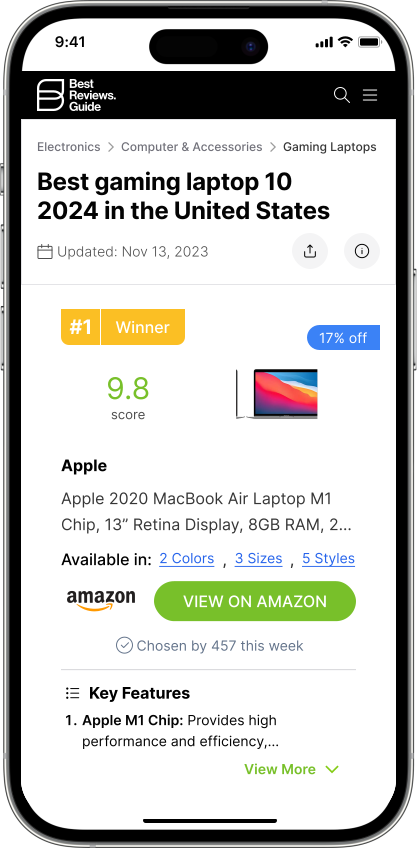
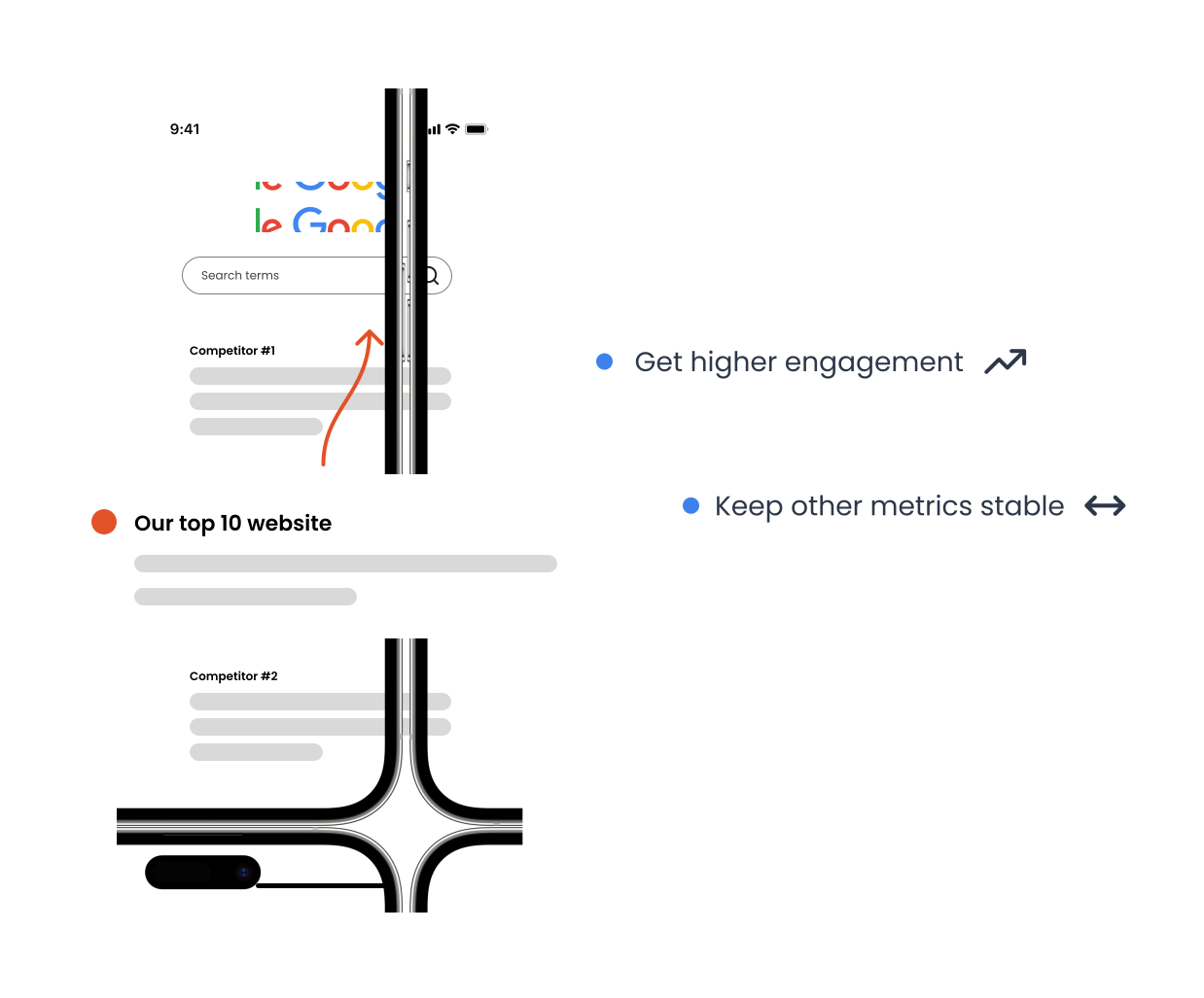
High Traffic, Low Engagement - Low Google Ranking
Data showed that on-site engagement was too low relative to our Google ranking. To improve rankings, we needed to increase engagement - without harming more critical metrics like click-out rate and conversion.
We are introducing "narrow-down" filter chips to simplify the shopping experience.
- •Significant EPU (earn per user) uplift ↑
- •Positive engagement trend (not significant)
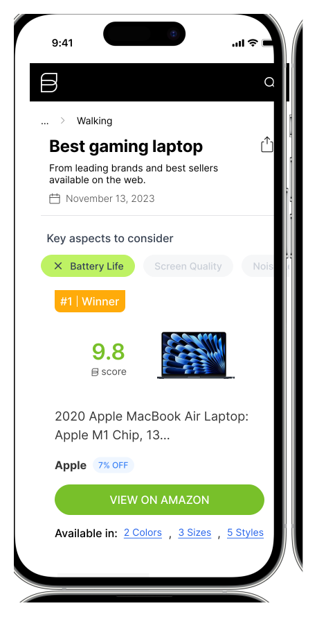
Historical data and user testing showed that heavy, engaging elements easily distracted users from their primary goals.
Designed lean, minimalist filter chips that invite interaction without causing cognitive clutter.
Initial testing revealed users were scrolling past the filters. I redesigned the layout to catch their eye while maintaining a seamless user experience
Communicated the value of the filters instantly, removing unnecessary copy to prevent information overload.
We noticed a really positive trend in clickout and EPU (earnings per user), but the overall engagement with the feature itself wasn't quite where we wanted it. To fix that, we ran another iteration focusing on the UI and messaging - making it more visually appealing and enticing for users to actually click on and try out.
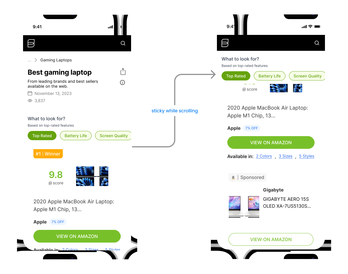
Small, targeted UX improvements that scaled across millions of monthly sessions.