
Seller Platform Amazon Creators Connection
A management system for Amazon sellers to monitor sales performance and manage inventory across all products promoted through Roundforest.
What is the Seller Platform?
The Seller Platform is one of Roundforest's products. Its a management system that helps Amazon sellers track performance and manage inventory for products promoted through Roundforest.
Read more
Roundforest works directly with Amazon sellers on a performance-based model. If sellers offer higher commissions than Amazon’s default, we promote their products and drive more sales.
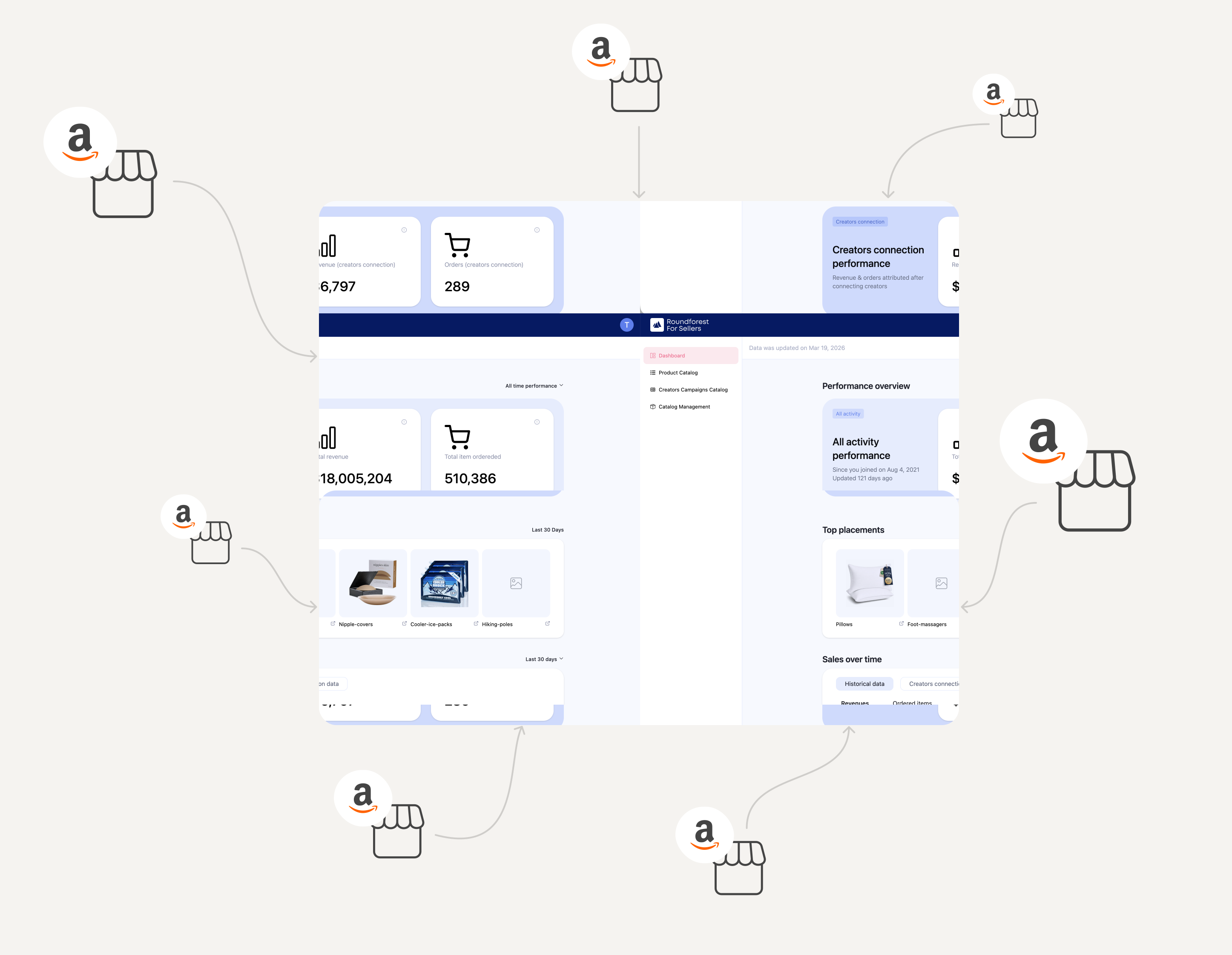
Challenge →
Integrate active sellers via their Amazon Creator accounts – motivating long-time sellers to migrate existing campaigns while encouraging adoption of higher-value configuration options, without forcing the choice.
Strategy →
Eliminate friction at every step. Automate what we can, minimize required actions, and design a low-effort path that's optimized for completion over compliance.
Results →
A majority of sellers completed the connection process in the first week of launch, and a measurable portion adopted higher-value configuration options – boosting engagement and revenue.
Mandatory migration to Amazon Creator for all sellers
We had a new requirement: all sellers needed to connect their accounts via Amazon Creator accounts to Roundforest seller platform.
There were two types of sellers:
The real challenge was the existing sellers – we were asking them to take extra steps in a flow they already knew.
Defining the baseline with the team
Since the seller platform wasn’t a core product, I had to learn the platform from scratch, from the user’s perspective.
First thing I did was to ask each relevant stakeholder in the company about the user flow and what is the main usage of the platform from the users side.
the main questions I asked to deep dived to understand the usage and flow of the platform were:
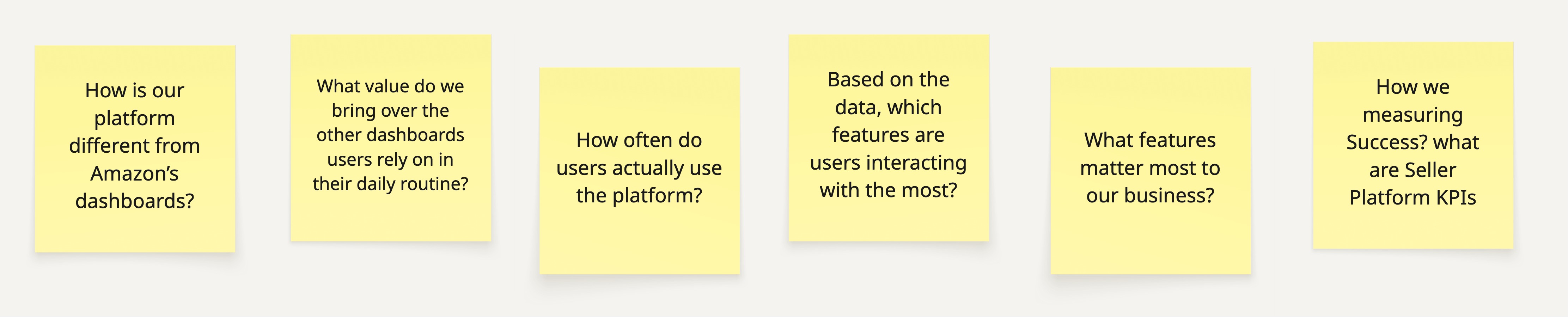
Before designing, I needed to map out our technical constraints. I sync’d with our senior backend engineer - a meeting that yielded crucial insights and completely reshaped our direction.
The key insight
We only needed one input from the user.
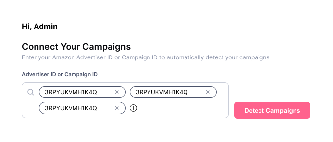
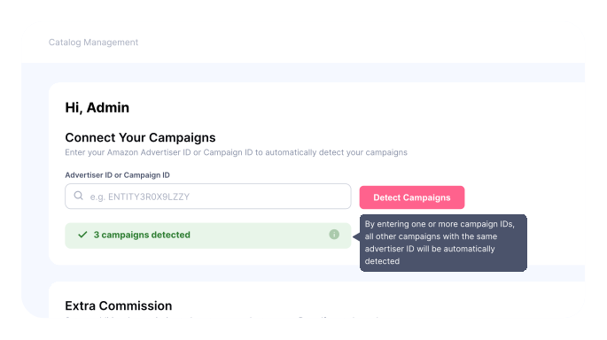
By entering a single campaign ID, the system could automatically detect all their campaigns and complete the migration.
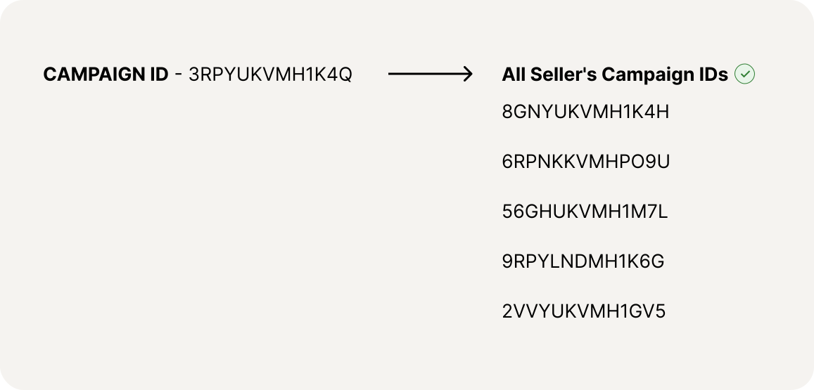
That was a great discovery because now I had few ideas of how I want to approach it from the UX side.
The Solution: Intelligent Auto-Detection
To simplify the workflow for sellers with multiple campaigns, I designed a single-input experience:
Key Design Reinforcements:
The user only needs to do one action to complete the migration
What is the best way to let him know about it?
I evaluated three implementation approaches, focusing on how to communicate the change effectively to the users. The priority was to maintain a seamless user experience and mitigate any potential friction.

Blocking the login flow until the connection was completed.

Displaying a modal upon login, followed by a persistent global header banner.

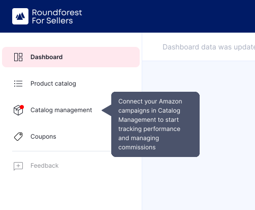
Keeping the core workflow intact and using a targeted sidebar tooltip next to the new "Catalog Management" page.
I chose Option 3 - By pairing this low-friction, contextual discovery with an email announcement
detailing the feature's value, we expected to see successful migrations.
After launch, we tracked usage and feedback.
Main issue:
Users didn't fully understand that one campaign ID connects everything.
So we improved it by:
The Impact
We were thrilled to see high user engagement right from the start. Due to time constraints, we launched with a closely monitored, iterative approach – tracking data and feedback from day one. My focus was translating business goals into a seamless flow, allowing us to stay agile and deploy quick fixes the moment any friction appeared.
What the Data Showed
The strategy paid off immediately, delivering great results for both the users and the business:
What's Next?
With the migration a success, we focused on optimizing the dashboard to drive deeper adoption. I sent out a seller survey to understand their daily behaviors and learn how they track performance, uncovering an amazing insight.
Sellers explicitly wanted to see a "before and after" view of how their configuration choices impacted their sales. Designing this clear ROI visualization is a massive win–it gives users the transparency they need while helping them make more informed configuration decisions, aligning user experience with business objectives.
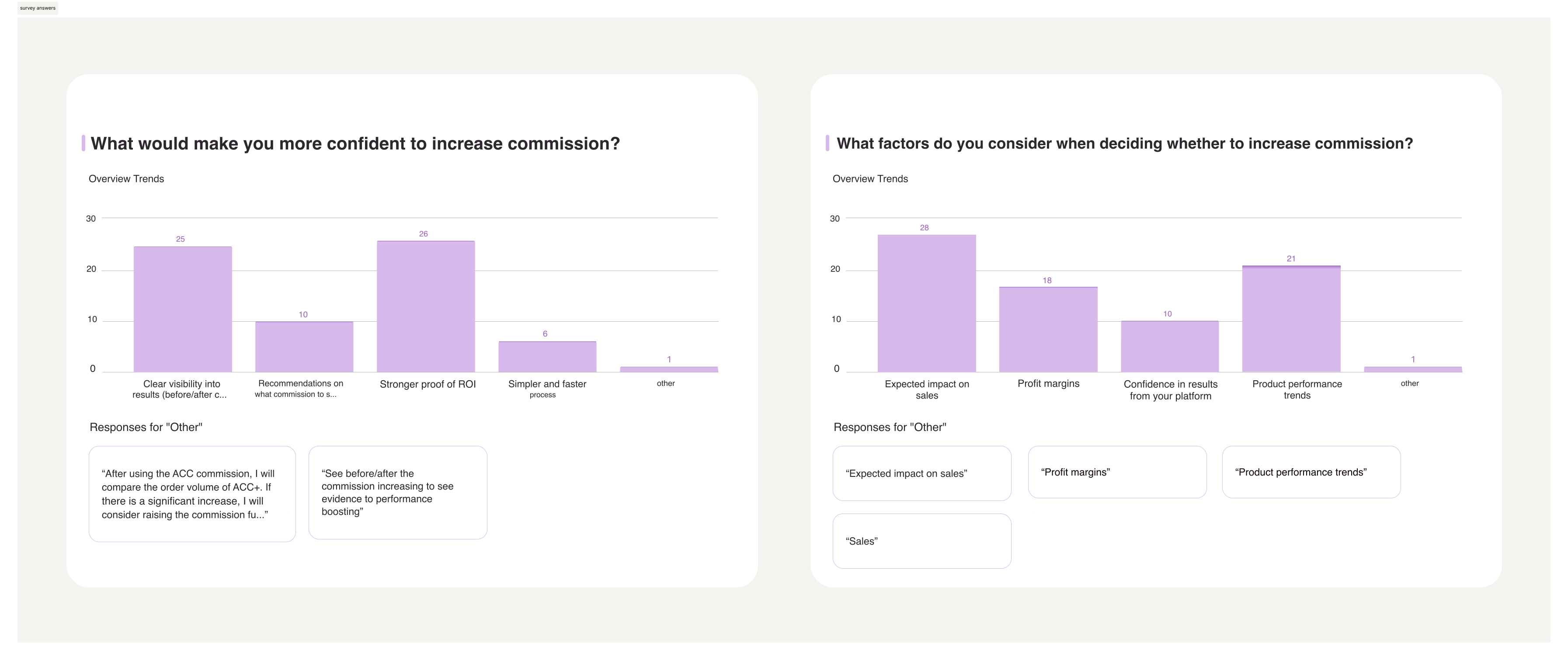
A sneak peak questions from the survey